Compare and contrast vector graphics and pixel images.
A: Vector graphics will not get blurry when you make the picture bigger or smaller, but pixel images will get blurry
What resolution is necessary to print raster images?
A: 300 DPI
What resolution is necessary to display raster images on the internet?
A: 72 DPI
Wednesday, November 26, 2014
Tuesday, November 25, 2014
Post #9
Who is Steve Jobs?
A: Steve Jobs is an American marketer, entrepreneur, and inventor who is the co-founder, CEO, and chairman of the Apple Incorporation.
What company was he CEO for many years?
A: The Apple Incorporation. What did he do for the computer industry?
A: He made computers sell a lot better after his creation of the Apple Macintosh computer.
How did this man impact the graphic design industry?
A: He revolutionized the design of technology by introducing a clean, simple and sleek products.
Post #8
Why must designers pay close attention to how color is utilized within a composition?
A: Colors can help set the mood in a composition or help the audience find the main foal point.Why is the color wheel an important tool for graphic designers?
A: The color wheel shows relationships between colors and help to create color schemes.
Find an example of neutral colors utilized within a design (hint: google poster design).
Near the sample, discuss why you feel the designer included neutral colors within the composition.
A: 
The designer included neutral colors to relate to the message the composition is conveying.
Briefly describe how we "see" the color of an object?
A: When light hits an object, objects absorb certain colors in the white light and reflects other colors making them to appear a certain color.
Post #7
Describe white light?
A: White light is the light from the sun and it is made of all colors.How do we see color if objects "have no color of their own"?
A: Light that shines on them consists of colors that are then reflected off the object, allowing us to see color on the object. The electromagnetic spectrum is also one of the factors that allows us to see color in objects.
What seven colors result when white light is refracted through a prism?
What seven colors result when white light is refracted through a prism?
A: Red, Orange, Yellow, Green, Blue, Indigo, and VioletDescribe hue?
A: Hue is the pure color of a color.
What happens with white?
A: White is created from all colors of the visible spectrum.
What happens with black?
What happens with black?
A: Black is the absence of light.
How color is perceived depends on what?
How color is perceived depends on what?
A: Depending on light wavelengths, colors can be perceived in many different ways.
What is a color wheel?
What is a color wheel?
A: A color wheel is a wheel of color that organizes color and shows the relationship of each other
What are primary colors? Name them?
What are primary colors? Name them?
A: Primary colors are colors that cannot be made from any other color and are only found in nature. Red, Yellow, and Blue.
What are secondary colors? Name them?
What are secondary colors? Name them?
A: Secondary colors are colors that are formed from primary colors. Orange, Purple, and Green.
What are tertiary colors? Name them?
A: Tertiary colors are colors that are formed from secondary colors. Yellow-orange, Red-orange, red-purple, blue-purple, blue-green, and yellow-green.
What are neutral colors? How can they be created?
What are neutral colors? How can they be created?
A: Neutral colors are earth-toned colors that are not usually on the color wheel and can be created by mixing complementary colors.
How can a neutral color help a design?
A: They can help rest the viewers eyes or lead them to a focal point.
What are complementary colors? Name them?
What are complementary colors? Name them?
A: Complementary colors are colors opposite on the color wheel. Yellow/Purple, Blue/Orange, Red/Green
What is color value?
What is color value?
A: Color Value is the brightness of a color.
What is a shade?
What is a shade?
A: Shade is a darker hue of a certain color by mixing black.
What is a tint?
What is a tint?
A: Tint is a lighter hue of a certain color by mixing white.
What is saturation/intensity?
What is saturation/intensity?
A: Saturation/intensity is how pale or strong a color is.
What happens when you mix complementary colors together?
What happens when you mix complementary colors together?
A: The resulting product is a neutral color.
What is a color scheme?
What is a color scheme?
A: A color scheme is the colors of colors in a design
Describe a monochromatic color scheme?
Describe a monochromatic color scheme?
A: A monochromatic color scheme is a color scheme that consists of tints and shades of one color.
Describe an analogous color scheme?
Describe an analogous color scheme?
A: An analogous color scheme is a color scheme of three colors next to each other on the color wheel
Describe a complementary color scheme?
Describe a complementary color scheme?
A: A complementary color scheme is a color scheme of colors opposite to one another on a color wheel.
Describe a split-complementary color scheme?
Describe a split-complementary color scheme?
A: A split-complementary color scheme is a color scheme in which one complementary color is omitted in the pair and colors of each side of it are used instead.
Describe a triadic color scheme?
Describe a triadic color scheme?
A: A triadic color scheme is one in which that colors on the color wheel form a triangle.
What colors are considered to be warm colors?
What colors are considered to be warm colors?
A: Red, Orange, Yellow, Brown, and Tan
Describe the psychology of a warm color scheme?
Describe the psychology of a warm color scheme?
A: Makes the audience feel more comfortable.
What colors are considered to be cool colors?
What colors are considered to be cool colors?
A: Blue, Green, Purple
Describe the psychology of a cool color scheme?
Describe the psychology of a cool color scheme?
A: Makes audience feel calm.
Why is important to consider which colors are being used within a design?
Why is important to consider which colors are being used within a design?
A: Colors can help an image give of a certain mood.
Thursday, October 9, 2014
Post #6
What is the pen tool used for?
A: The pen tool is used to add anchors onto your artboard.
How can you manipulate a path/line in Illustrator? Discuss the use of the white arrow tool. Pen+, pen-,and convert tool.
A: You can drag an anchor to make a curved line and the white arrow helps to select specific things in your design such as anchors. The pen+ helps to add anchors and pen- deletes existing anchors.
How can you utilize the layers palette in Illustrator?
A: You can work on several different designs without having to worry about deleting a part of the other design you made.
How do you create a clipping mask in Adobe Illustrator?
Step 1: Create the object you want to use as a mask.
Step 2: Move the clipping path and the objects you want to mask into a layer or group
Step 3: In the Layers panel, make sure that the masking
object is at the top of the group or layer, and then click the
name of the layer or group
Step 4: Click the Make/Release Clipping Masks button at the
bottom of the Layers panel or select Make Clipping Mask
from the Layers panel menu.
Post #5
For each of the 5 elements of design (shape, line, texture,
space, value), find an example that utilizes each element
within the design (Google search for poster design,
advertisement, etc.). You should have 5 DIFFERENT
sample designs. For each, evaluate the design in 4 to 5
sentences. Label each with the appropriate element. Then,
discuss how that particular element is used and how it
enhances the design.
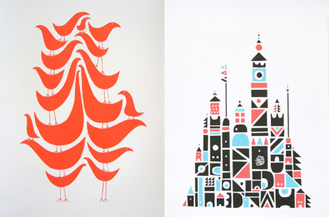
Shape: Used to make birds and castles
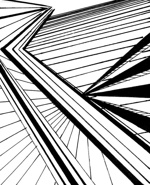
Line: Used to show a path
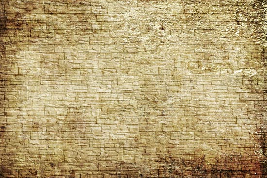
Texture: Used to show texture of brick wall

Space: Used to depict many birds
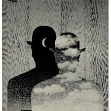
Value: Shows many shades of black and white.
space, value), find an example that utilizes each element
within the design (Google search for poster design,
advertisement, etc.). You should have 5 DIFFERENT
sample designs. For each, evaluate the design in 4 to 5
sentences. Label each with the appropriate element. Then,
discuss how that particular element is used and how it
enhances the design.
Shape: Used to make birds and castles
Line: Used to show a path
Texture: Used to show texture of brick wall
Space: Used to depict many birds
Value: Shows many shades of black and white.
Post #4
Why/how can icons be used to communicate?
A:Icons help to explain things with pictures. For example, a
picture of a fork and spoon on an amusement park map
represents place where you can buy food from.

I chose this icon because it effectively represents what it is. The icon represents that something is "locked".

This icon accurately represents that you have to "throw your trash into a trashcan".
What is the difference between copyright and public domain?
A: Copyright is when you have to get the permission of the
creator to use their work, while public domain is when you
have access to work of creators that are over 70 years old.
How can you avoid plagiarism in this class? In other
classes?
A:You paraphrase or you can cite.
A:Icons help to explain things with pictures. For example, a
picture of a fork and spoon on an amusement park map
represents place where you can buy food from.
I chose this icon because it effectively represents what it is. The icon represents that something is "locked".
This icon accurately represents that you have to "throw your trash into a trashcan".
What is the difference between copyright and public domain?
A: Copyright is when you have to get the permission of the
creator to use their work, while public domain is when you
have access to work of creators that are over 70 years old.
How can you avoid plagiarism in this class? In other
classes?
A:You paraphrase or you can cite.
Post #3
What is OSHA? What do the letters stand for?
A: OSHA is the Occupational Safety and Health
Administration
Administration
How can graphic designers effectively communicate? In
your own words, explain the communication process.
A: They can communicate through their designs.
Understanding the history, culture and movements of fine
and graphic arts will make you a better producer of visual
messages. Why?
A: It is so you don't make mistakes that were already made.
Video #1 Elements of Design
1. What does it take to create good graphic design?
A: It takes the knowledge of the element and principles of
graphic design to make a good graphic design.
graphic design to make a good graphic design.
2.What is the difference between elements and principles?
A: Elements are the components which should be isolated in
any visual design, while principles tell us how we should
organize our elements.
any visual design, while principles tell us how we should
organize our elements.
3.Name the six (6) elements of design.
A: The 6 elements of design are line, shape, space, texture,
value and color.
value and color.
4.What can lines aid in, when alone or combined with other
lines or shapes?
A: They can aid in the readability, appearance and message
of the design.
of the design.
5.Which lines suggest a feeling of rest? Why do you think?
A: Horizontal lines suggest a feeling of rest because it is in
relation to gravity.
relation to gravity.
6.Vertical lines communicate a feeling of what? Why do you
think?
A: They give off the feeling of loftiness because it feels as if
subject is higher.
subject is higher.
7.What lines suggest a feeling of movement? Why do you
think?
A: Diagonal lines suggest a feeling of movement because
they are unstable in relation to gravity.
they are unstable in relation to gravity.
8.Soft, shallow curved lines suggest what? Why do you
think?
A: They suggest safety and comfort.
9.These lines suggest confusion and turbulence? Why do
you think?
A: Sharp, acute curves suggest confusion and turbulence.
10.What element defines a specific area of space? What is
the difference between two dimensional shapes and three
dimensional shapes?
A: Shape defines a specific area of space. Two dimensional
objects are flat and have width and height while three
dimensional objects have depth, width and height.
objects are flat and have width and height while three
dimensional objects have depth, width and height.
11.Describe the difference between geometric shapes and
organic shapes?
A: Geometric shapes are structured, often symmetrical
shapes, while organic shapes are found in natural or can be
man made shapes.
shapes, while organic shapes are found in natural or can be
man made shapes.
12.What are abstract shapes?
A: Abstract shapes are stylized or simplified versions of
natural shapes.
natural shapes.
13.Which basic shape projects an attitude of honesty or
equality?
A: A square
14.What do triangles suggest?
A: Action
15.Circles convey feelings of what?
A: Protection or infinity
16.Describe positive space and negative space?
A: Positive space refers to the object and elements used in
a design, while negative space refers to the shapes around and between the objects or elements.
17.What is texture? Incorporating texture into a design can help do what?
A: Texture is the actual surface of the design. Incorporating texture into a design can help make it realer.
a design, while negative space refers to the shapes around and between the objects or elements.
17.What is texture? Incorporating texture into a design can help do what?
A: Texture is the actual surface of the design. Incorporating texture into a design can help make it realer.
18. What is value? What is another name for value?
A: Value is the degree of light and dark in a design.
Tone.
19.What can the element of color do when incorporated into a
design?
A: Conveys mood,creates images, attract attention, and
identify objects.
Tuesday, September 2, 2014
Post #1
Q. Why did you take this class? What goals do you have for the class?
A: I took this class because I am interested in how to make computer
art and to expand my imagination and ability to create art. My goals
in this class is to be able to design art that represents who I am.
A: I took this class because I am interested in how to make computer
art and to expand my imagination and ability to create art. My goals
in this class is to be able to design art that represents who I am.
Friday, August 29, 2014
Subscribe to:
Posts (Atom)